

Analysis and Redesign of Franklin Madison’s Enrollment Form Template
Page two of the original form
Problem
Franklin Madison's insurance enrollment form template is used across all product offerings for all our clients. It was designed over ten years ago and as we expanded into digital marketing and mobile usage, no longer met the needs of the user or the company. The form needed to be a customizable template so client representatives could use it across hundreds of different brands for a variety of products specifically suited to each client's needs.
Method
To address the issue, I identified the most significant pain points by conducting a heuristic evaluation of the form, followed by a user test, and finally through direct observation. Based on this research, I developed a series of recommendations and created a wireframe concept for the redesign.
Heuristic Evaluation
My research began with a heuristic review of the form's design and overall flow. Although the form was only four pages long, I identified several issues:
Typography: Important information, such as policy dollar quotes, was styled like and nested in fine print, making it difficult for users to locate.
Error Reporting: Errors were only indicated just below the first accordion fold, and users couldn't keep both folds open simultaneously. This forced users to recall the error details and to locate them on subsequent pages to resolve the issues.
Field Flagging: The form used two different styles to flag required fields. This confused users as to what was actually required for progression.
Information Inconsistencies: There were inconsistencies between the information on the checkout page and the follow-up emails sent to users. This caused uncertainty about the product that users just purchased, and casted doubt over the entire process.
WCAG/ADA Compliance: The form had several accessibility issues, including ambiguous labeling on progress buttons. This could lead to legal issues and corporate fines.


User Test
Working with the development team, I set up a testing scenario in our staging environment, allowing me to interview testers as they navigated the marketing funnel from email to checkout. At the end of each test, I asked the testers questions about the material they read, the design they interacted with, and the policy they bought. My observations included:
Cost Visibility: Only one tester could locate the cost of the selected product. Most testers believed the purchase button would reveal the quote, leading to premature purchases.
UI Navigation Issues: Testers missed required entry fields, and had difficulty correcting the issue
Policy Information: None of the testers could identify key information about their policy, such as the coverage start date or insurer.
While the overall flow itself was rated easy to accomplish, the issues above gave the testers an uneasiness about the purchase they just made. One tester said that while the intent to make the purchase was there, they just wanted to get a quote for the policy when they made their purchase, and would feel like the company was trying to "pull a fast one" on them if this occurred in real life.
Direct Observations
Using Crazy Egg, I observed and analyzed several hours of screen capture data containing user interactions with our marketing website and form. Key findings include:
Navigation Issues: Users frequently alternated between the form and the marketing page, indicating they were searching for information. Errors often went unnoticed due to poor error message clarity and positioning.
Missed Fields: Users frequently missed required form fields, sometimes multiple times in a single session.
Flag Confusion: Users often relied on only one of the two types of "requirement" flags, leading the user to ignore the other type of flag and error out.
Mobile Traffic Increase: As digital sales efforts ramped up over a period of six months, there was a 50% increase in mobile traffic. With the age of the form at over 10 years old, mobile considerations have only been superficially added. This often caused frustrations with navigation.
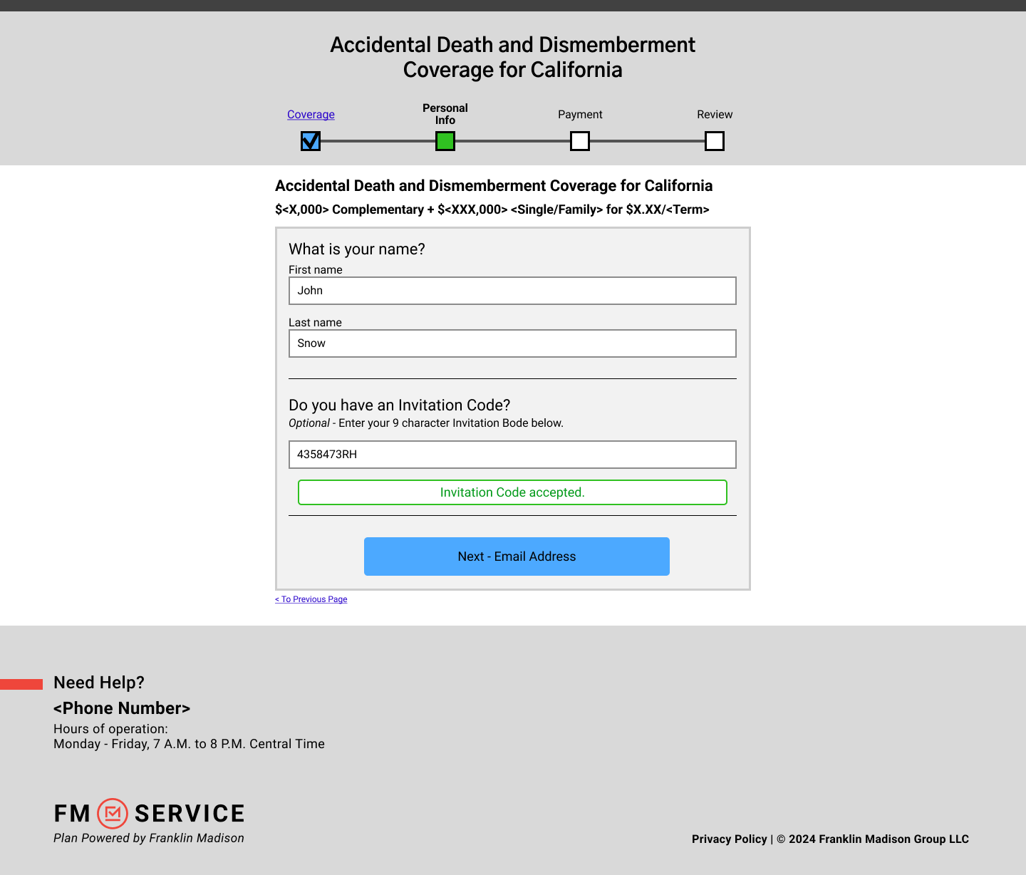
Wireframe Solution
Policy Selection Screen - Filled
Given the extensive issues with the form and advancements in form design and research in the 10 years since its original launch, I opted for a complete redesign rather than incremental changes. Because of our need to get approval on any design changes from our business partners, the prototype design was left in wireframe with the assumption of adding our partner’s branding later in development. The new design adheres to modern mental models of forms, focusing on usability and clarity for both desktop and mobile. Key aspects of the redesign include:
Simplified Steps: Research indicates that conversion rates drop when form steps contain more than three fields. To avoid overwhelming users, I minimized user entry fields over several screens.
Clear Information: I dedicated the first page of the form flow to clearly present what the customer was about to purchase and the associated costs.
Focus on Mobile: The simplified layout allows mobile users to focus on the core objective on the page with minimal scrolling, allowing the user to focus their attention on page conversion.
Modular: Given the template nature of the project, I wanted each page and data entry point to be modular so client representatives could create easily customizable flows for clients.


Outcome
After completing the redesign, we conducted a moderated user test to evaluate user reactions to the new design. Aside from a few minor design tweaks, the wireframe prototype tested well. The redesigned form significantly improved user experience and operational efficiency. Key outcomes include:
Enhanced User Satisfaction: Users found it easier to locate key information, reducing confusion and premature purchases. The clear presentation of policy details and associated costs improved users' confidence in their purchase decisions.
Improved Accessibility: The form now complies with WCAG/ADA standards, making it more accessible to all users, including those with disabilities. This compliance not only enhances user experience but also mitigates potential legal risks.
Greater Flexibility: The modular design allows client representatives to easily customize the form for different clients, enhancing usability across various brands and products. This flexibility ensures that the form is adaptive to a wide range of products and client needs.
Mobile Optimization: The focus on mobile usability addresses the significant increase in mobile traffic, ensuring a seamless experience for mobile users. The simplified layout minimizes scrolling and keeps users focused on the core objectives, improving conversion rates.
The results of the user test provided leadership with sufficient justification to approve further development of the wireframe into a functional alpha to test APIs and start showing to clients for initial buy-in and further testing.